UNIVARIATE ANALYSIS
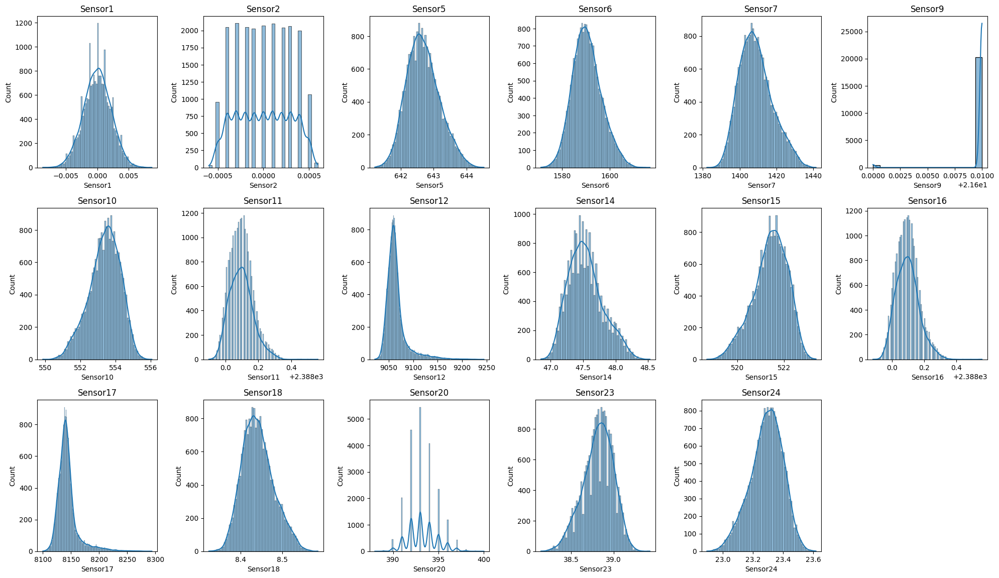
Some of the variables follow normal distribution. On the other hand some variables like Sensor9 are constant.
DISTRIBUTION OF TARGET VARIABLE
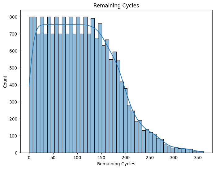
There is equal distribution for instances with remaining life between 0 and 150
BIVARIATE ANALYSIS
Pairplots
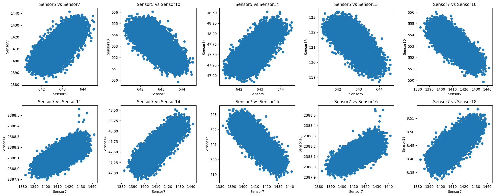
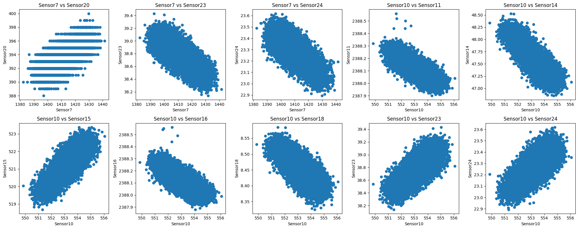
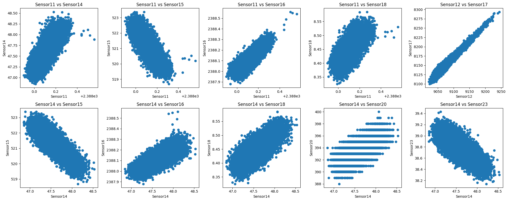
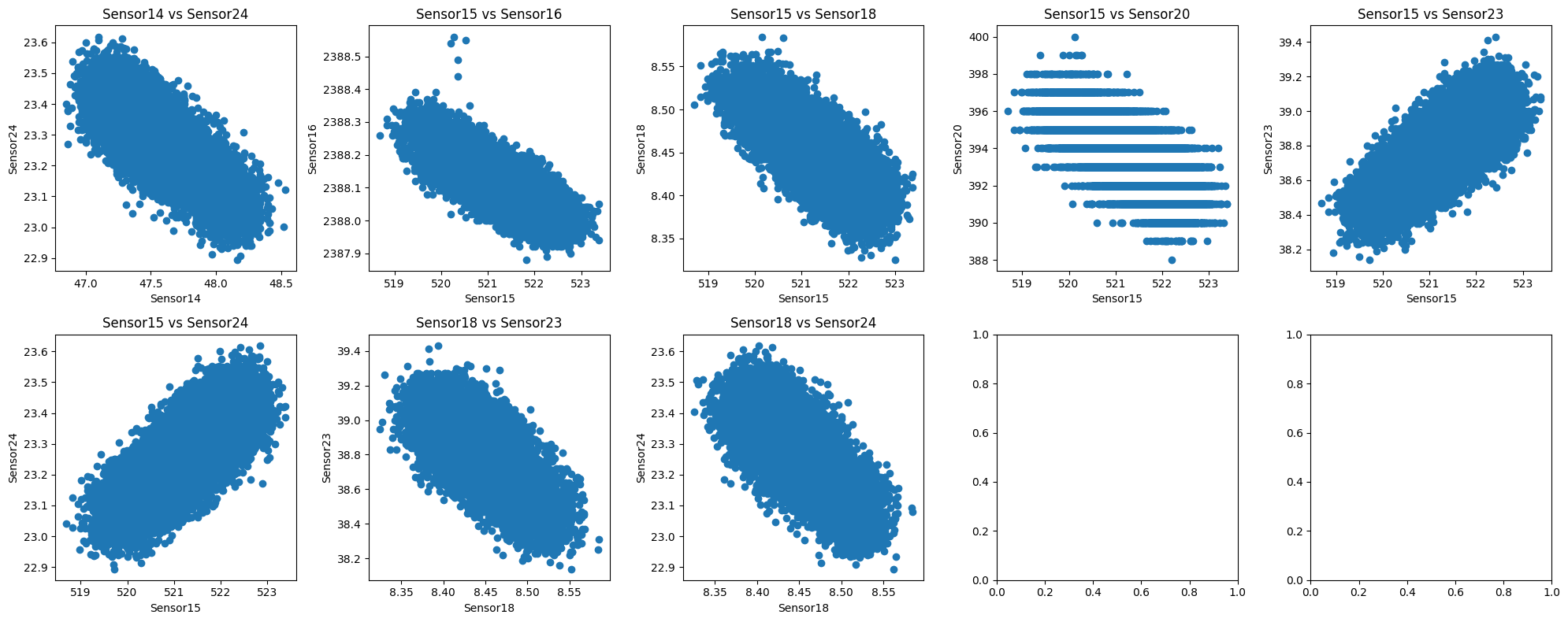
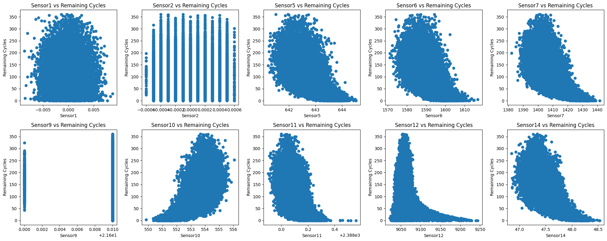
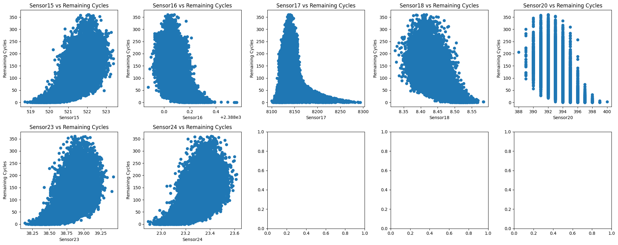
Some of the features have a relationship between them. On the other hand, the values of certain sensors have the same value, irrespective of remaining cycles.
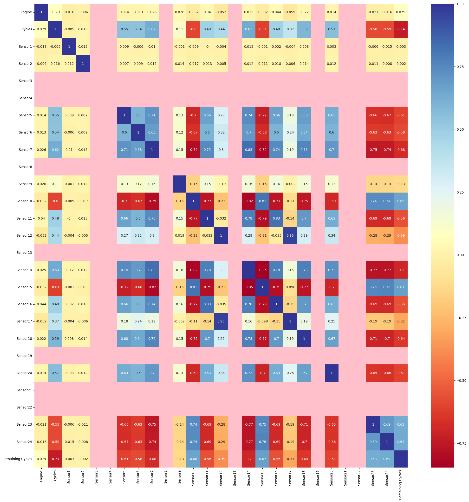
Heatmap
The pink areas show there is little to no correlation between the respective variables. As expected, all the sensors we found independent of cycle are indicated as having no correlation with Cycle(and thus, remaining cycle) However, we see strong multicollinearity between the independent variables.
MULTIVARIATE ANALYSIS
ANDREW'S CURVE
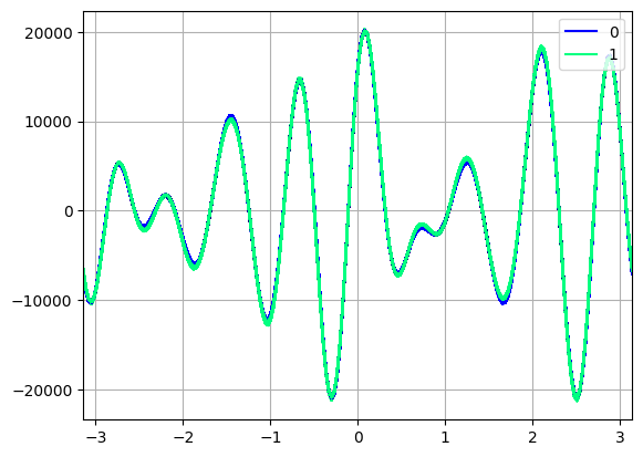
Andrews curves are used for visualizing high-dimensional data by mapping each observation onto a function
The data points which had remaining cycles < 50 (chosen arbitrarily) were grouped into the class 1. The remaining were grouped into class 0.
We can see that the Andrew's curve representing class 0 and class 1 are more or less the same, except in a few places (where protruding blue areas are visible).
Parallel Coordinates plot
A parallel coordinate plot is graphical method where each observation or data point is depicted as a line traversing a series of parallel axes, corresponding to a specific variable or dimension. This arrangement allows for the exploration of relationships, trends, and variations that might be obscured in raw data.
The hue is based on the remaining cycle of each datapoint in the dataset. Here dark blue lines represents a high number of remaining cycle and yellow represents remaining cycles closer to zero.
We see all those values of a particular sensor for which the remaining cycles are low. The graph is interactive, so feel free to play around with it by dragging across any of the vertical axes, which selects a range of values from that axis.